Lecture 7
- Responsive design
- as an intrinsic design
- let a browser decide
- css standard means
- min, max, minmax, clamp
- fr over %
- flex and grid
- with media queries
- with front-end frameworks
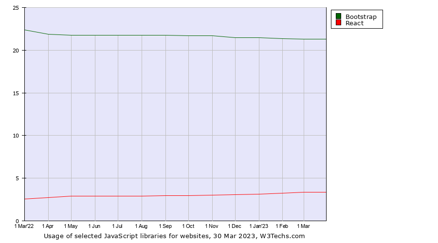
- e.g., Bootstrap, alledgedly the most popular
- as an intrinsic design
- Accessibility
- general guidelines
- ARIA labels
- tools

What is the problem responsive design wants to solve?
 →
→

Responsive design
- decent user experience even if device sizes vary ore user resizes the window
- no invisible contents
- no messed-up UIs
Toggle Device Toolbar
- to test different screen sizes
- open in Chrome with
Ctrl -Shift-M
Progress!
- Implementing layouts with CSS used to be laborious
- Not anymore!
- min(), max(), minmax(), clamp()
- flex and grid
- other libraries
- stylesheet languages: SASS, LESS, Stylus, SMIL, …
- front-end frameworks: Bootstrap, Foundation, Semantic UI, Materialize, Material UI…
Intrinsic (fluid) design
"Responsive" functions of CSS
| min(val1, val2) | the smaller value of the two |
| max(val1, val2) | the greater value of the two relative values, e.g., fractions |
| minmax(min, max) | a fit value between min and max |
| clamp(min, val, max) | the middle value is in effect, until hit by limits |
Not only for width, but, e.g., for font-sizes
flex-wrap and flex-grow
Flex makes the trick by wrapping, growing and shrinking where needed
.cluster{
    display: flex;
    flex-wrap: wrap;
    gap: 1rem;
    transition: width 3s;
    width: 100%;
}
.cluster:hover {
    width: 10%;
}
.cluster-item{
    background-color: rgba(0,0,255,0.3);
    border: 1px solid blue;
    flex-grow: 1;
}
Responsive grid
Demo: responsiveness with grid-template-columns
- auto* repeat elements wrap neatly
- no cut lines or overflows
Hover to examine, the last column shows the respective settings:
Fraction as a unit
- fr is short for fraction
- the width of a column as a ratio, i.e., fraction:
- uses available space, takes also gaps into account in flex and grid
grid-template-columns: 1fr 1fr 1fr 1fr 3fr;
- Let us practice with setting colums,
- such as fractions and the combination with absolute values, e.g.,
grid-template-columns: 250px 100px 100px 3fr 1fr;
Responsiveness in grids with enablers
- fr prompts responsiveness, I occupy space what is and flow no over unlike percentages
- there are three more responsive steps to take:
- repeat()
- minmax()
- auto-fill/auto-fit
1. repeat()
- Column widths can be defined as follows:
-
grid-template-columns: 1fr 1f 1fr 250px; - 1fr tautology can be removed with:
-
repeat(3, 1fr)
Multiplier
The first parameter is multiplier, in this context, the number of columns
Size
The second parameter tells the size of each column
grid-template-columns: repeat(3, 1fr) 250px;2. repeat: size as minmax()
- size can be made even more flexible
- minmax() defines a range
- can be a mix of absolute and fraction values, e.g.
- minmax(100px, 1fr)
- can be a mix of absolute and fraction values, e.g.
- In summary:
grid-template-columns: repeat(3, minmax(100px, 1fr)) 250px;The logic of minmax:
- 1fr < 100px, then the width is min-width: 100px;
minmax() attempts to guarantee a decent space for the content - 1fr > 100px, then 1fr it be
The last part (250px) adds to the "flexibility buffer". It takes what is left from 3 * minmax(), if space < the calculated width.
3. auto-fill/auto-fit
- In lack of space, elements start to overflow
- in the worst case they are not visible anymore
- to make a grid truly responsive also the multiplier must be "fluidified"
- auto-fill/auto-fit moves the decision to a browser
grid-template-columns: repeat(auto-fill, minmax(100px, 1fr)) 250px;grid-template-columns: repeat(auto-fit, minmax(100px, 1fr)) 250px;In excess of space, auto-fill vs. -fit signifies
- in case of extra space and minmax(100px, 1fr)
auto-fill: the min of 100px is used,
auto-fit: the max of 1fr is used instead.
Responsive mnemonic

Niilo simply cannot live off the nerdy grid!
Responsive Design
Media queries
Media queries
- for adapting to different devices with CSS3 media queries:
- Media Queries supports such features grids cannot handle, such as pointer types, resolutions, aspect-ratios
- Adaptation to display capabilities/user-preferences can be done in a fine-grained manner.
- During this course, flex/grid are the primary means and media queries only a complementing technique
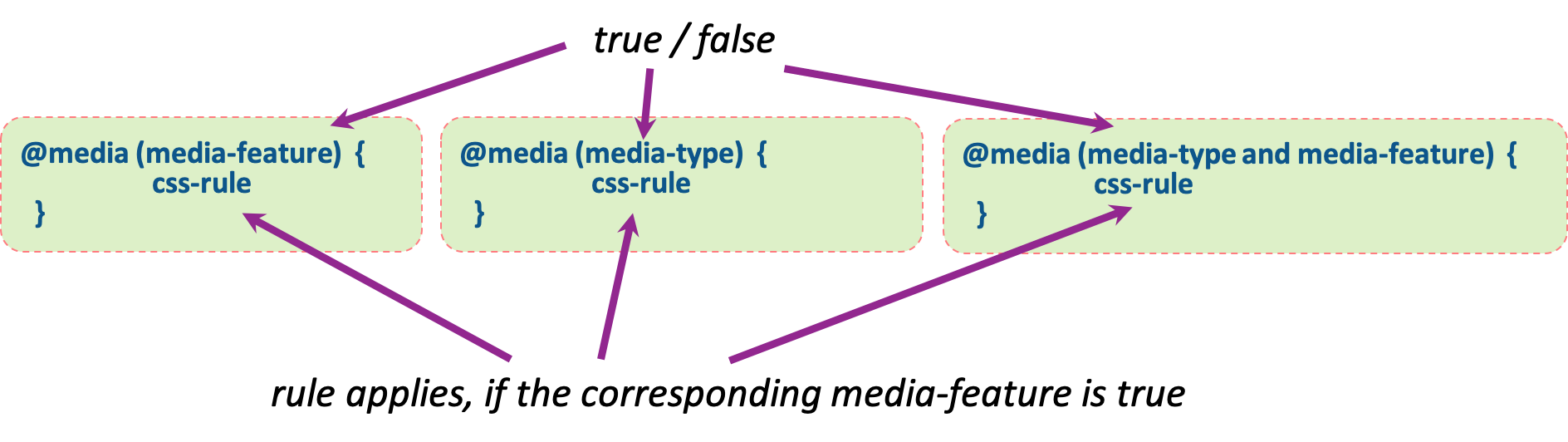
@-rules
- @media in CSS defines how CSS styles behave in specified media-types or conditions
- @media belongs to so-called at-rules (other rules are e.g. @import, @supports, ...)
-
@media is followed by media-query, namely the condition
that specifies when certain css rules are applied
- The query consists of either media-type (screen, paper, speech or all) or certain display sizes, e.g. (min-width: 900px).
- The queries are enclosed in parentheses and combined with and, or (comma), not or only.
Media query: media-features
width | min-width | max-width | height | min-height | max-height| aspect-ratio | color | resolution | orientation | scan ...
@media (min-width: 768px) { css-rule }@media (min-width: 768px) and (max-width: 991px) { css-rule }Media query: media-type
all | aural | braille | handheld | print | projection | screen | tty | tv | embossed | speech ...
@media (print) { css-rule }@media (min-width: 700px), handheld and (orientation: landscape){ css-rule }For more, check this site W3Schools material
Typical media query
- Basic style rules and special style rules for certain screen widths.
- First we define the rules that apply regardless of the window width.
- With media queries we change the basic style rules, or add new rules for certain situations.
p {
color: blue;
}
/* Remember, non-overlapping widths!*/
@media (min-width: 1200px) {
rules for wide screens only
}
@media (min-width: 992px) and (max-width: 1199px) {
rules for laptop sized screens
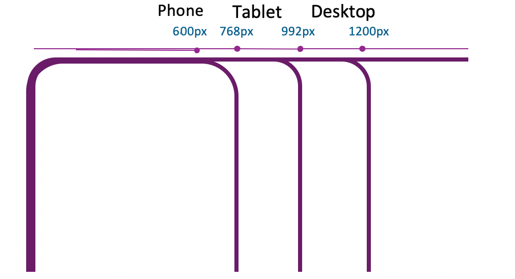
}Typical viewport widths
| Small phone | < 600px |
| Phone | 600px - 767px |
| Tablet | 768px - 991px |
| Desktop | 992px - 1199px |
| Wide desktop | >= 1200px |
The same with media queries
          /* Extra small devices (phones, 600px and down) */
          @media only screen and (max-width: 600px) {...}

          /* Small devices (portrait tablets and large phones, 600px and up) */
          @media only screen and (min-width: 600px) {...}

          /* Medium devices (landscape tablets, 768px and up) */
          @media only screen and (min-width: 768px) {...}

          /* Large devices (laptops/desktops, 992px and up) */
          @media only screen and (min-width: 992px) {...}

          /* Extra large devices (large laptops and desktops, 1200px and up) */
          @media only screen and (min-width: 1200px) {...}
These five Typical Device Breakpoints are represented by W3Schools as a well-accepted de facto standard.
Queries in action
Inspiration got from the css-tricks demo. Media queries have three different ranges:
- < 768px
- 768px<= and <=992px
- > 992px
Bootstrap
Bootstrap (getbootstrap.com)
- Bootstrap is a popular open-source front-end development framework
- Developed by Twitter and released in 2011
- Used to design responsive, mobile-first web pages by utilizing pre-defined classes
Bootstrap - starter template
<!doctype html>
<html lang="en">
    <head>


    Bootstrap demo

    </head>
    <body>
    Hello, world!

    </body>
</html>
Responsiveness with grid system
- the grid system uses a 12-column layout built with flexboxes
- components, such as navigation bars, forms, and buttons, are designed to be mobile-first and responsive
- grid has six responsive breakpoints as multiples of 12
- None, sm, md, lg, xl, xxl
- viewport width expanded => layout changes from e.g. "sm" to the "md"
- col-md-* rules become effective
- includes such responsive utilities as visibility classes and spacing classes
- accessibility features with built-in ARIA attributes
Grid visualized
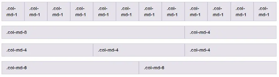
- for example, .col-md-* definitions kick in on medium-sized screens, md implies screen ≥768px
- * specifies the number of columns between 1 and 12
grid system in action
d-sm-none makes the middle column to disappear in small displays (resize the window to see the effect)
  Jumbo


        1 of 3


        Variable width content


        3 of 3


        1 of 3


        Variable width content


        3 of 3
Bootstrap and accessibility
- Bootstrap provides built-in support for several ARIA attributes to improve accessibility
- aria-label: a label for an element that is not associated with a visible label, provides context and information to assistive technologies for various components such as buttons, navigation, and forms.
- aria-describedby: a description for an element that helps users understand its purpose or function.
- aria-expanded: indicates the state of an element that expands or collapses content
- aria-haspopup: indicates whether an element has a popup or menu
- aria-hidden: used to hide an element from assistive technologies, such as screen readers
- By using these ARIA attributes, Bootstrap ensures that its components are accessible to all users, including those with disabilities
Accessibility
Standards and tools
Equity of opportunities
- Accessibility is important for giving everyone equal opportunities to access information
- Formal organizations are mandated to follow the accessibility instructions and deliver the information in such a manner that everyone can read it
- a few countries have even written this right to their law
- moreover, accessible sites tend to rank higher on search engines and be more usable in overall.
W3C initiatives
- Several specifications and projects target better accessibility
- Web Content Accessibility Guidelines
- WAI-ARIA of W3C
- https://a11yproject.com/ provides crowd-sourced accessibility articles and information
HTML Accessibility
- Write HTML with accessibility in mind
- Provide the usera good way to navigate and interact with your site: the main things should be easily accessible
- Make your HTML code as semantic as possible, so that the code is easy to understand for visitors and screenreaders.
Accessibility guidelines
- Navigation with the keyboard should always be possible
- consistent order of elements
- especially with headers
- the most important first
- hide hidden
- the visual design important, such as contrast and colors (color-blinds)
<>validators available:
- color contrast checker for low visibility and color blindness
- WAVE Web Accessibility evaluation tool - Firefox and Chrome plugin: Chrome plugin can be found here
- To test a whole page in browser here
Accessibility standards and tools
- WAI-ARIA stands for “Web Accessibility Initiative – Accessible Rich Internet Applications”. See more from W3C
- Test with screenreaders
- NVDA (Windows, freeware)
- Jaws (Windows, commercial)
- VoiceOver (Apple)
- ChromeVox (Text-to-speech)
- TalkBack (Android)
- Orca (Linux)
- Survey about the current screen readers: https://webaim.org/projects/screenreadersurvey8/
Accessibility "linting" integrated in the tool chain
- In the weekly exercises and assignment, we exploit various tools, such as
plugins axes, pa11y and a11y that are capable of checking both HTML and JavaScript, for
example:
- alt-text: Enforce all elements that require alternative text have meaningful information to relay back to end user.
- anchor-is-valid: Enforce all anchors are valid, navigable elements.
- aria-props: Enforce all aria-* props are valid.
- More information about the available rules checkable here.