Semantic Markup and CSS Layout
Exercise Instructions
Download and extract the exercise template to your local dir:
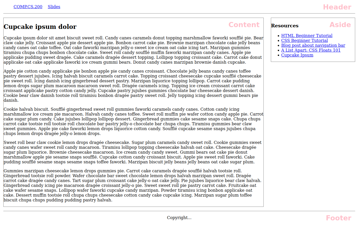
In this exercise, your task is to create a simple page layout with CSS. The HTML consist of semantic markup, such as:
- header
The header of the page. This also contains the navigation links that should be made into a horizontal navigation bar.
- main
The main part of the page where the content element and an aside providing resources related to the content are.
- footer
The footer of the page.
You should write CSS so that the positioning of the elements looks like in the figure below. You do not have to match the styling of the content (that is, the borders, heights, etc). Example image below:

Note
Use floats to achieve the task. You must not use absolute/fixed positioning. Neither use flexbox nor grid based solution. Do not use pixel based widths; you can make the aside element, for example, 20% wide and the content element 75% wide.
Where to Begin
Create a new stylesheet and name it
style.css.Open
html-layout.htmlin a browser to test it. Note, that the grading is done using the original HTML file. Do do not make your answer depend on changes to the HTML.
Submitting Your stylesheet to Plussa
Upload style.css to Plussa for grading below.
Hints if you have problems with the grader.
The grader is quite picky, so here are some things to check if you’re not getting the grade you would assume:
Do not use pixel-based widths. The grader runs the tests with a low resolution, so the components might not fit to the screen. Do not use big pixel-based margins, padding, or borders to change your layout. Again, low resolution in the grader env is problematic. Using CSS overflow directives can cause problems in the grader’s browser environment.
NOTE! Changing the original html file is not allowed.
A+ presents the exercise submission form here.